Taylor Dolan grew up immersed in stories, with her mother reading to her nightly, fostering her love for narrative art. She performed in over 40 theater productions as a child, sparking her interest in storytelling through performance.
She earned a bachelor's degree in Fine Art from Trinity University in San Antonio, Texas, studying photography, drawing, sculpture, painting, and printmaking. Dolan later obtained an MA in Children's Book Illustration from the prestigious Cambridge School of Art in England; she also studied at Wells College in Paris, Edinburgh College in Scotland, and the University of Cambridge.
Taylor has illustrated seven books in the UK and US, including a re-illustration of The Phantom of the Opera for The Folio Society, and authored/illustrated the Ghoul Scouts series, starting with Welcome to Camp Croak. Her dip-pen-and-ink style draws from influences like Harry Clarke, Aubrey Beardsley, and Quentin Blake. She has exhibited in about 20 shows and contributed to two Emmy-winning productions. Her work blends theater, body language, and narrative, often using distorted poses inspired by Butoh dance for horror elements. She views illustration as "flattened theatre," directing stories in a single image.
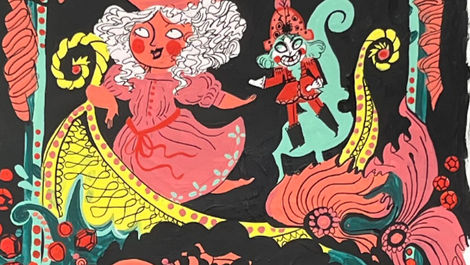
Taylor has recently been entered for the 2026 Victoria and Albert Illustration Awards, for The Nutcracker, published by the Folio Society. About this commission she writes,
" The brief was to simply bring Alexandre Dumas’ version of ‘The Nutcracker’ to life with only six interior spreads, endpapers, cover and slip case for the Folio Society. It was equally daunting and exciting to be invited to be a part of a story with such a lineage of art attached to it. My intention heading into the project was to combine elements of traditional set design as an homage to the ballet and orchestral scores with illustration. I achieved this by creating ornate frames and borders twisting around with each spread in a similar treatment many set designers have used to frame the stages they create their art for. I also knew, quite early on, that the colors had to feel candy-esque. It is easy to lean into the reds and greens of Christmas, but this story demanded a much broader and more playful palette."


